|
Brides who want a rustic look and feel will start steering away from the barn look to a more “woodsy” look according to Taylor Green of Taylor Elise Events in St. Louis, Missouri. This includes a lot of greenery in the florals and green as the wedding’s main color. “We’ll also move away from burlap and see more wooden details,” she explains. Wooden details can include the invitation, table numbers, seating cards, tags, chargers, signage, chairs and tables.”
Wedding Wire Trends for 2018
0 Comments
I have survived the weddings of 3 of my adult children. Below are some great tips that will help ease your stress are various times in the planning of your children's wedding. Hope it helps.
Remember, we can help with your wedding needs. Custom invites, veils, wedding jewelry and accessories, party favors, bridal party gifts... the list goes on.. Come in an see us in Downers Grove. Thanks, Mary Kay A guide to help you help your child make the big day hassle-free! 1. Get rid of your own expectations.These days, no matter who is paying, “the bride and groom are the captains of the team, and they’ll say what happens and when,” says Sharon Naylor, author of Mother of the Groom (Citadel Press, $16) and The Mother-of-the-Bride Book(Citadel Press, $16). Too much input from you can cause them a lot of stress when you should be trying to be their support system. 2. Pick your battles. If there are elements you’d love the wedding to have―a certain ethnic tradition, a mother-son dance―choose the most important one (or few) and present it as a request. 3. Start out on the right foot. “Tell the couple, ‘Here are some of the things I might be able to help with―just tell me what you want,’” says Naylor. “That will often get you invited in to help more than if you try to bulldoze them.” 4. Don’t promise more than you can deliver. “Make sure that what you volunteer to help with is realistic,” she says. “Especially on the weekend of the wedding, with family in town, you may not want to be stuck ironing tablecloths for a big party you offered to host.” And you don’t want to cause panic when someone has to be recruited at the last minute to fill in for you. 5. Get to know the in-laws. Traditionally, after the engagement is announced, the groom’s parents reach out to arrange a get-together, but there’s no need to stand on ceremony. Often the bride and groom will invite both sets of parents to a dinner to meet and discuss initial thinking about the wedding plans. 6. Don’t try to outdo the other mother. It can only cause friction for you and potential stress for the kids. You both should be in it for them. 7. Let the bride’s mom pick her dress first. Custom says once she has chosen hers, she lets the mother of the groom know the color, length, and style so she can choose a complementary dress (keep the wedding photos in mind). Both moms should stay away from whites and the colors of the bridal party. 8. Don’t invite people too soon. Don’t start calling relatives as soon as the engagement is announced. To avoid an etiquette gaffe, wait until the guest list is finalized and you know how many people on your side can be accommodated. 9. Practice discretion. “If you’re not crazy about some person or some element of the wedding, keep it to yourself,” says Naylor. “Otherwise, that gossip will inevitably end up floating around at the wedding, and it could cast a shadow on the couple’s big day.” 10. Give a sentimental gift. If you’ve paid for a part of the wedding or honeymoon, consider presenting them with something sentimental, like a family heirloom. Or, from the registry you might choose a pie plate your son or daughter will use at every holiday and think of you. This is a way to say, ‘We welcome you into the family,’ and reflect that there’s life after the wedding.
 From WWD issue 9/10/15
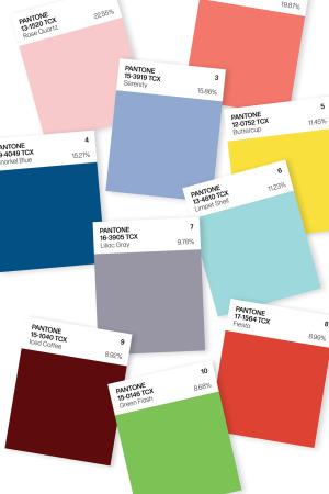
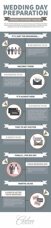
By Rosemary Feitelberg Pantone’s Top 10 colors for spring are meant to ease the daily grind. There’s a psychological reason for that, according to Pantone Color Institute executive director Leatrice Eiseman. “The fact that technology has gotten so overwhelming and so 24/7 has really created a great part of the need for these comforting, softer colors. Technology plays a huge part in people feeling like they want to stop the world and get off,” she said. “At the same time, we can’t deny that global doors are opening — as in Cuba and other south-of-the-border places.” How else to explain Rose Quartz as this season’s number-one color for women and men? Other soothing shades can be found in the remaining top-five hues — Peach Echo, Serenity, Snorkel Blue and Buttercup. The second half of the top 10 — aqua Limpet Shell, Lilac Gray, warm red Fiesta, Iced Coffee and Green Flash — hint at other kinds of reprieves and allow for some unexpected color combinations. In addition, the healthy art world has sparked interest in some of the unexpected hues. Designers also referenced colors favored by Matisse and Picasso, which have had blockbuster New York shows in the past year or so, and Frank Stella, Esther Stewart and Sam Falls also factored into the list. “Bright and abstract art has become more of a mainstream thing. At one point in time, we would talk about art from a very elitist standpoint and it was hard to bring the world of art into a fashion forecast. But today people have accessibility. They can go online and don’t have to go a museum,” Eiseman said. Rose Quartz along with Peach Echo, Serenity, Limpet Shell, Lilac Gray and Iced Coffee are among Pantone’s new colors. Other shots of more vibrant colors can be attributed to consumers’ appreciation for the lush vegetation in urban design. “Whether they get outside or not, they at least want to be within eyeshot,” Eiseman said. “We’re even seeing a lot of botanical prints for interiors. People want patterns with a vegetation look.” Here, more detail on the top 10: 1. Rose Quartz 13-1520 Percentage of designers who used this color: 22.55 “This really is a beautiful pink that will radiate well on the skin for women as well as men,” Eiseman said. “Women can always be helped along by cosmetics, but guys have to rely on the colors they’re wearing to sometimes make them look a little healthier.” 2. Peach Echo 16-1548 Percentage of designers who used this color: 19.87 “We know the oranges have been hanging in there even though historically orange is a color that comes and goes. Peach Echo is a very warm, friendly and accessible color,” Eiseman said. 3. Serenity 15-3919 Percentage of designers who used this color: 15.86 “As the name suggests, Serenity is a calming color that plays to the whole idea that we know we’re still living in turbulent times. Blues simply relay that feeling of relaxation,” Eiseman said. 4. Snorkel Blue 19-4049 Percentage of designers who used this color: 15.21 Eiseman said this shade is “meant to be a bit more fun, less serious than navy, and serve as one of the anchor colors for the spring palette.” 5. Buttercup 12-0752 Percentage of designers who used this color: 11.45 “Buttercup is all about sunlight, happiness and cheer — this one just speaks to give us a ray of sunshine, something to be hopeful about. It really energizes,” Eiseman said. 6. Limpet Shell 13-4810 Percentage of designers who used this color: 11.23 “Lovely and refreshing,” Limpet Shell is a blue that has a slightly green twinge, according to Eiseman. Given the number of news stories about climate change concerns, it’s not surprising that in recent seasons many people are instinctively reaching for cooler colors and blues, she added. 7. Lilac Gray 16-3905 Percentage of designers who used this color: 9.78 “There is a need for neutrals every season and this one has a hint of the purple family that is soft and subtle,” Eiseman said. “In light of the state of the economy, people are still mindful about the way they spend their money. If they invested in gray in recent seasons, as many people have, this is a color that is not going to say to them, ‘Oh, that’s so yesterday — I have to get rid of that.'” 8. Fiesta 17-1564 Percentage of designers who used this color: 8.99 “The south-of-the-border influence really plays heavily into this particular shade of red, which is more warm-based than a cha, cha, cha red. It’s very free-spirited,” Eiseman said. 9. Iced Coffee 15-1040 Percentage of designers who used this color: 8.92 “With a tan disposition, Iced Coffee has a warmth that combines well with everything else,” Eiseman said. 10. Green Flash 15-0146 Percentage of designers who used this color: 8.68 With a yellow undertone, this bright green would be well-accepted for spring or summer. “Urban design is very much at the forefront of people’s minds. It’s a fantastic color to combine with others and it may be the driver to buy something new,” she said. 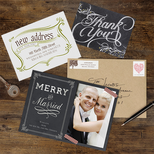 After you send your wedding invitations, there is still important stationery you’ll need and want to send. And we’ve made it easy for you to do so in a stylish, personal way. Thank You Notes
Of course you know that you need to send thank you notes for wedding gifts and to people who helped you out in a special way on the big day. It’s a good idea to get those thank you notes ordered before the wedding so you have them ready to write as soon as you get back from the honeymoon. Choose a design that coordinates with your wedding invitations and the style of your wedding. We love our Whimsical Chalkboard thank you notes for a chalkboard, black and white or vintage theme wedding. Moving Announcements If you’re moving to a new home after the wedding, let everyone know your new address with an adorable moving announcement. There are so many designs – one is sure to match your style, like our rustic and natural Stamp of Approval moving announcement postcard. Photo Holiday Cards Make the first holiday cards you send as a married couple extra special by adding your favorite wedding photo to the design. The cards will definitely become keepsakes! One of our favorite designs is this Merry and Married photo holiday card with a chalkboard design and sweet saying. Address Labels Save lots of time when you’re addressing thank you notes, moving announcements and holiday cards by using personalized address labels that coordinate with the stationery you’re sending. We chose the Leafy Tree address label design to match the kraft paper envelope – browse all the designs to find that one that’s perfect for your style. Don’t forget to check out our great personalized note cards and other stationery for writing letters and keeping in touch long after the big day! 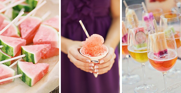 How do you help guests keep cool during your summer wedding? With iconic hot weather treats, jazzed up for your big day!  We love this blog post from Carlson Craft. Hope you do too! 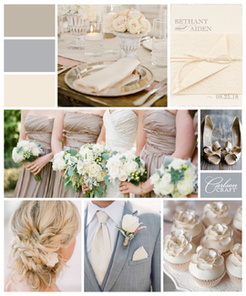 Neutrals are done taking the back seat. They’re so over being the underlying tone for pops of color. Bland? Don’t EVEN say that about them.
Because neutrals are now taking center stage at weddings – they’re the main event when it comes to unique color schemes. How do you make a neutral wedding color theme work? Check out the ideas I’ve put together, and you’ll see how neutrals stand out in a way that’s fresh and stylish. When you think neutral, think beyond white and ecru. Also think beyond using just one color as your theme. Neutrals are rich and varied in tone and temperature, so don’t be afraid to mix them together to create warmth and beauty. For instance, choose warm taupe, a warm grey and a deep cream for an interesting and complex blend. Afraid your dress won’t stand out? If you choose the right neutrals for bridesmaids’ dresses and accents, it won’t! Dress your maids in darker neutrals like a light chocolate or a deep taupe. Keep your flowers simple, and the bride will definitely be the highlight. Speaking of flowers, choose a flower type, like a rose, in a single color, like a creamy white. Use the flowers liberally. They won’t compete with your color scheme and they’ll add unexpected touches of beauty everywhere, like your hair. Neutrals can go a little on the metallic side, so add in some sparkle! Pale gold and a soft silver will stand out in a gorgeous way against the neutrals. And make sure you introduce your wedding with a subtly styled invitation that will make a big impact, like our Wrapped in Magic wedding invitation. The deckled edges and the textured wrap layer on the interest, making each neutral piece work together for a great impression. Blog originated 9/15/14 http://blog.carlsoncraft.com/industry-trends/wedding-trend-neutral-wedding-colors-164764.html |
|