|
From WWD issue 9/10/15
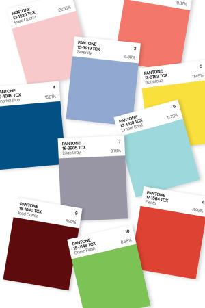
By Rosemary Feitelberg Pantone’s Top 10 colors for spring are meant to ease the daily grind. There’s a psychological reason for that, according to Pantone Color Institute executive director Leatrice Eiseman. “The fact that technology has gotten so overwhelming and so 24/7 has really created a great part of the need for these comforting, softer colors. Technology plays a huge part in people feeling like they want to stop the world and get off,” she said. “At the same time, we can’t deny that global doors are opening — as in Cuba and other south-of-the-border places.” How else to explain Rose Quartz as this season’s number-one color for women and men? Other soothing shades can be found in the remaining top-five hues — Peach Echo, Serenity, Snorkel Blue and Buttercup. The second half of the top 10 — aqua Limpet Shell, Lilac Gray, warm red Fiesta, Iced Coffee and Green Flash — hint at other kinds of reprieves and allow for some unexpected color combinations. In addition, the healthy art world has sparked interest in some of the unexpected hues. Designers also referenced colors favored by Matisse and Picasso, which have had blockbuster New York shows in the past year or so, and Frank Stella, Esther Stewart and Sam Falls also factored into the list. “Bright and abstract art has become more of a mainstream thing. At one point in time, we would talk about art from a very elitist standpoint and it was hard to bring the world of art into a fashion forecast. But today people have accessibility. They can go online and don’t have to go a museum,” Eiseman said. Rose Quartz along with Peach Echo, Serenity, Limpet Shell, Lilac Gray and Iced Coffee are among Pantone’s new colors. Other shots of more vibrant colors can be attributed to consumers’ appreciation for the lush vegetation in urban design. “Whether they get outside or not, they at least want to be within eyeshot,” Eiseman said. “We’re even seeing a lot of botanical prints for interiors. People want patterns with a vegetation look.” Here, more detail on the top 10: 1. Rose Quartz 13-1520 Percentage of designers who used this color: 22.55 “This really is a beautiful pink that will radiate well on the skin for women as well as men,” Eiseman said. “Women can always be helped along by cosmetics, but guys have to rely on the colors they’re wearing to sometimes make them look a little healthier.” 2. Peach Echo 16-1548 Percentage of designers who used this color: 19.87 “We know the oranges have been hanging in there even though historically orange is a color that comes and goes. Peach Echo is a very warm, friendly and accessible color,” Eiseman said. 3. Serenity 15-3919 Percentage of designers who used this color: 15.86 “As the name suggests, Serenity is a calming color that plays to the whole idea that we know we’re still living in turbulent times. Blues simply relay that feeling of relaxation,” Eiseman said. 4. Snorkel Blue 19-4049 Percentage of designers who used this color: 15.21 Eiseman said this shade is “meant to be a bit more fun, less serious than navy, and serve as one of the anchor colors for the spring palette.” 5. Buttercup 12-0752 Percentage of designers who used this color: 11.45 “Buttercup is all about sunlight, happiness and cheer — this one just speaks to give us a ray of sunshine, something to be hopeful about. It really energizes,” Eiseman said. 6. Limpet Shell 13-4810 Percentage of designers who used this color: 11.23 “Lovely and refreshing,” Limpet Shell is a blue that has a slightly green twinge, according to Eiseman. Given the number of news stories about climate change concerns, it’s not surprising that in recent seasons many people are instinctively reaching for cooler colors and blues, she added. 7. Lilac Gray 16-3905 Percentage of designers who used this color: 9.78 “There is a need for neutrals every season and this one has a hint of the purple family that is soft and subtle,” Eiseman said. “In light of the state of the economy, people are still mindful about the way they spend their money. If they invested in gray in recent seasons, as many people have, this is a color that is not going to say to them, ‘Oh, that’s so yesterday — I have to get rid of that.'” 8. Fiesta 17-1564 Percentage of designers who used this color: 8.99 “The south-of-the-border influence really plays heavily into this particular shade of red, which is more warm-based than a cha, cha, cha red. It’s very free-spirited,” Eiseman said. 9. Iced Coffee 15-1040 Percentage of designers who used this color: 8.92 “With a tan disposition, Iced Coffee has a warmth that combines well with everything else,” Eiseman said. 10. Green Flash 15-0146 Percentage of designers who used this color: 8.68 With a yellow undertone, this bright green would be well-accepted for spring or summer. “Urban design is very much at the forefront of people’s minds. It’s a fantastic color to combine with others and it may be the driver to buy something new,” she said.
0 Comments
|

